Beananing Kwuurt Institute
A not-for-profit Aboriginal organisation welcoming Indigenous communities of Western Australia with an inclusive and vibrant message of support and hope.
Sector
Community / Not for Profit / Arts
Scope
Brand Creation / Brand Strategy / Positioning / Illustration / Creative Toolkit / Online styling
BKI offer emergency relief for families who are experiencing hardship, and work to benefit the Aboriginal community and inspire their people to know they are valued and where they are now is not their future.
-
Our first task was to update their logo to give them recognition through the more accessible acronym of ‘BKI’ instead of their full name of Beananing Kwuurt Institute.
‘Beananging’ is Noongar for the beginning of a new day, the part of the day when the sky begins to lighten, but before the sun has risen. ‘Kwuurt’ is Noongar for heart.
Beananging Kwuurt represents ‘A new day for Aboriginal people’ symbolising the place for healing, caring and nurturing.
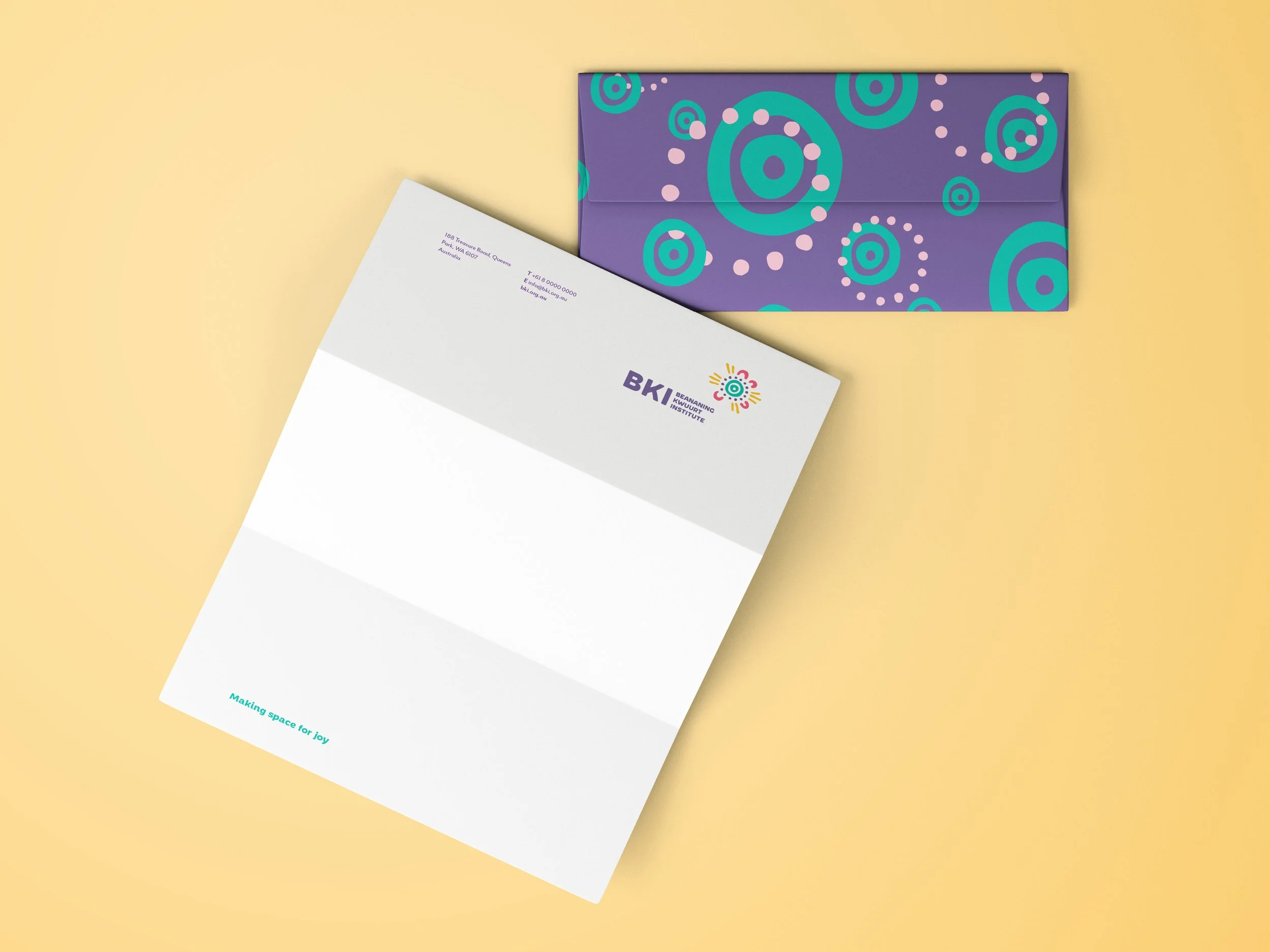
Their vibrant new logo speaks to their name through Aboriginal symbolism. We incorporated the concentric circles which represent the symbol for ‘meeting place’, by adding dots around the circles this then became a star or sun, the ‘U shaped symbols represent man and woman.
The result is an energetic and radiating emblem, that shines its gaze like a sun (or new dawn) over BKI.
On branding we sought to clearly communicate their mission of “Making space for joy”.
We created a new look and feel that brought the energy of the community centre to life. Through colour, pattern and shape we constructed a visual language what was able to be at once Indigenous, modern and vibrant.
New fonts and simple type arrangements allowed BKI to communicate their messages simply and effectively to their community.


